Kajabi Course Assessments
platform
Responsive Web
Audience
All Kajabi Users
Deliverables
Feature Update
overview
Kajabi is an all-in-one business platform for knowledge entrepreneurs. Kajabi makes it easy to build, market and sell your online courses, membership sites, coaching program, and more. In 2022, Kajabi hit $4B in GMV with its ~57K user base creating 300K products.
CHALLENGE
One of the challenges Kajabi faces is providing a consistent and modern experience across all of its products. Our initial assessment offering was built in July 2017, and no further investment has resulted in feature degradation. Today usage is at 22%, but Assessment adoption has been slowly growing at 1-3% yearly after the initial launch. Additionally, Our direct competitors offer a better quiz solution at a lower price point. Thinkific, Teachable and Podia range from $29-$79/mo. The features they offered were: grading, showing correct answers and a simplified drag & drop quiz builder. To stay competitive, we have to offer best-in-class course-building features.
audience/user
customers offering course(s) within Kajabi
TEAM
1 PM • 1 UX Designer • 1 UX RESEARCHER • 1 tech lead • DEV team
role
Product Manager
research
Customer Survey • Affinity Mapping • Competitive Analysis
I kicked off Discovery with UX Design & Research to understand user behavior, needs, and motivations. To help frame the problem, I pulled data showing that current usage was 22%. However, weekly usage of Assessments is ~1.41%. Additionally, I gathered feedback from CX support tickets and customer feature requests.
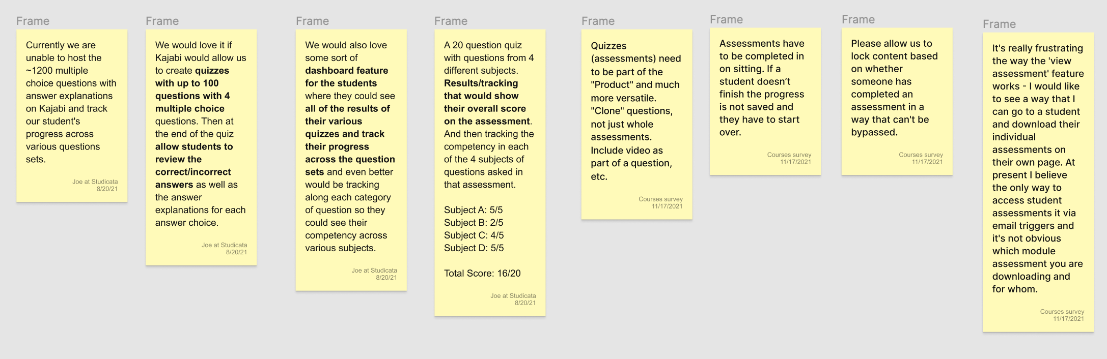
We wanted to dive deeper to understand our customer’s problems. Working with UX Research we created a customer survey and learned the following pain points:
Pain Point |
Opportunity |
|
Slow/Clunk User Flow |
Create a new improved drag & drop quiz builder. Adding new features such as duplicating a question and adding images to answers. |
|
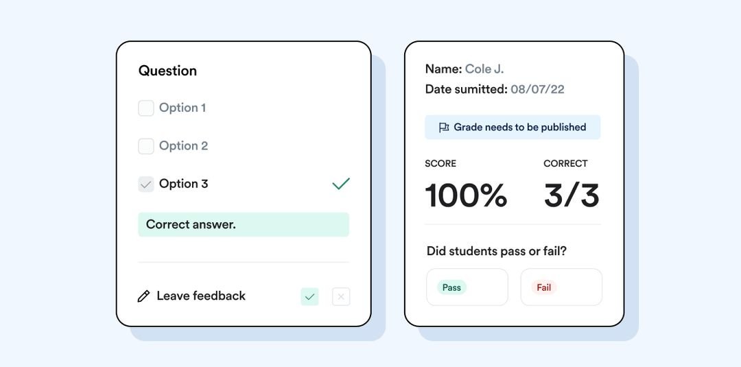
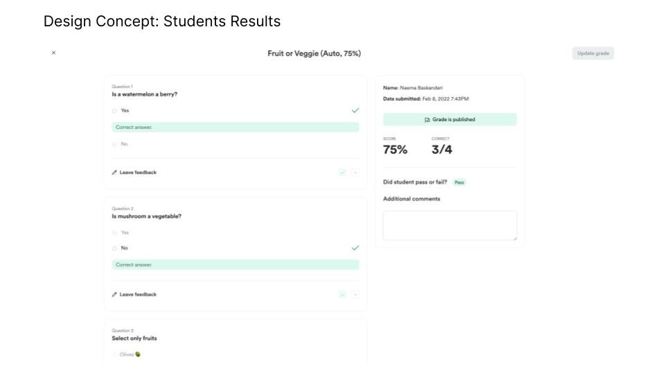
Hard to view results
|
|
|
Difficult to Locate |
Move the feature to an intuitive location |
competitive analysis


design
Wireframes • User Flows • Prototypes

Our first area of focus was the “Builder” step in the customer journey. The original Assessment builder was dated and very difficult to use. Adding a single question with answers would take multiple steps. Our goal was to reduce task completion time by creating a more intuitive builder.
Understanding from research findings that users had a difficult time locating the assessments feature, We moved the access point to a more intuitive location, inside a course.
Design Concepts


PROTOTYPING & USER TESTING
Prototyping • Moderated User Testing
The design concepts were then transformed into an interactive prototype to be tested with our customers that included new & existing assessment users.

INSIGHTS
From the initial survey additional discoveries we made not mentioned above, was thatcourse certification is the most desired feature. A feature that does not exist today. And 54% never used the feature at all.
Usability testing revealed users were hoping for more advanced functionality, such as more question types, required questions, etc. Not just feature parity which was our goal with the initial release
Go To Market
Our GTM plan included an alpha phase to gather feedback before we released it to our customer base. We incorporated their feedback into the release.


Takeaways
Moving the location of the button. We hypothesized that moving the quiz button to a level above would increase the discoverability and usage of the feature. With the assessment button now hidden for new users, we can accurately validate our hypothesis.
Not removing the Assessment button during Quiz GTM. Needed a better plan of how to phase out the assessment button before launch. The decision was made to leave the Assessment button due to the large migration effort.
Migration effort not estimated correctly. It was estimated that migration would take 2-3 weeks during discovery. However, later realized it would take six weeks. A decision was made to add two new features to quizzes to make quiz a magnet feature and entice customers to transition over themselves.
NEXT STEPS
I have been measuring the adoption of the feature, which is now at 6% since its release. The goal is to have adoption reach 15%. My hypothesis of adding magnet features to entice customers has not been successful. Therefore next steps will be to build the migration to move over the remaining power users to the new quiz feature. This will allow us to sunset the existing assessments feature.